Navigating Portals on Mobile Devices
Header Bar and Menu
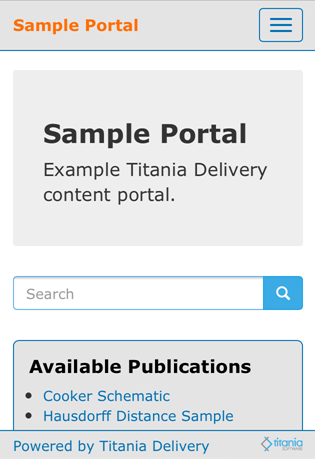
Titania Delivery Portals have a header that contains various links. In addition on some pages, web portals also have a search form.

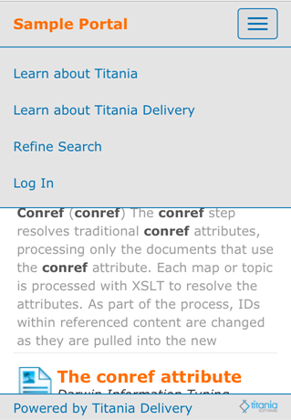
However, on smaller screens, this would take up too much horizontal space. To save that space, HARP moves the links and the header to a menu box once the screen becomes too small.

Table of Contents
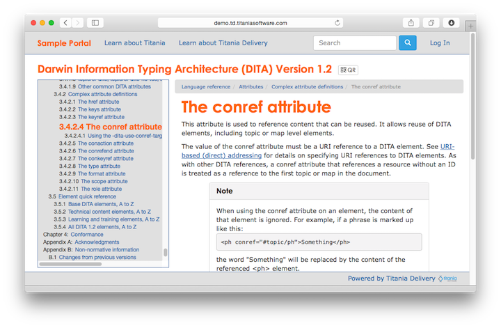
When viewing a DITA topic through a Portal, the table of contents for the current publication appears on the left with the current location highlighted.

When viewing on a mobile device, the Table of Contents uses too much space on the smaller screen, so the table of contents is not visible. In this case, a Table of Contents link appears in the header menu allowing you to switch back and forth between the content of the current topic and the table of contents (seen above).
Refining Searches
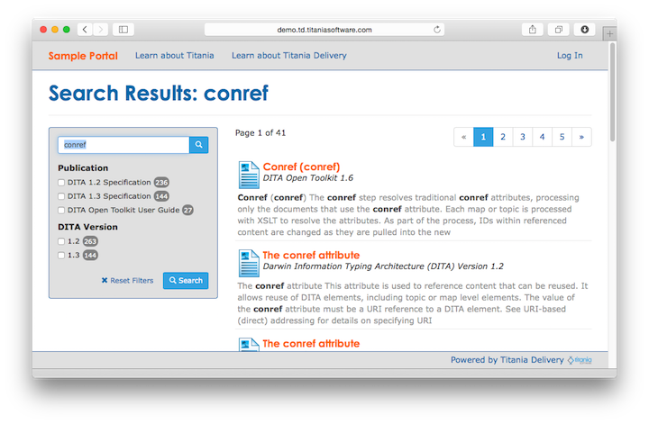
The Search Results page has a form that enables users to perform another search or to refine the current search using Search Facets

When viewing on a mobile device, this also uses too much space on the smaller screen. Therfore, on the topic viewing page, there is a Refine Search link available on the heading menu that enables users to toggle back and forth between the search results and the search form.
